In the article
Creative Anarchy at Its Very Best it talks about the ways on how to bend rules to make a design better and give it more of an eye catching theme. The author argues that following rules to graphic design will make your design boring, lame, uncreative so instead of following them bend the rules a little bit and go in your own path "Design is everywhere. Poor design creates chaos." (Denise Bosler).
The article though has many strengths like giving quotes from famous people and researching them to find a quote from Michelangelo. Another strength would be the creative topic, title and picture which is grabbing the readers attention. What the author can work on is keeping the reader attentions there are points where it just started going from interesting to boring to interesting and that can be fixed, but right now thats annoying.
The authors general conclusion in this entire article is your knowledge is limitless it just requires bending rules and going your own route.
Critique
1. The author stays on his point throughout the entire passage and continuously mentions it.
2.The evidence is very convincing and stays on topic like the transition from "poor designs creates chaos" to the ballot card box in 2000 for the U.S. presidential election.
3. This gives very good information to help graphic designers see what you have to do to create something eye opening that catches peoples attention and makes them want what ever it's advertising.
Creative Anarchy at Its very Best
By: Denise Bosler and Lasse Skarbovik


 A key event in this entire process is probably the third project because thats where our skills were put to the test and showed how committed you are at getting your video done in time, and who ever made the best got onto ONW NOW(sadly not mine). My thoughts through this process was me asking myself how can I make this better what can I do? Eventually I got an idea for a cool background for the interview, but it didn't go very well because there weren't any chairs available so the set up wasn't that great. When I went to the gymnastics place it was a little uncomfortable, but it all turned out good I got a ton of shots and hey I don't really talk much and I didn't have to.


 In Graphic design class we have been working on making logos using our initials and we had to go through many steps to complete this process.
 2nd we went to someone and talked to them about how we wanted


 I realized I didn't really like it simplified, but I loved the color and the thought of the circle, but then it hit me I have to do something to make my T stick out since it's my first name so I shrank the B and hid it in the back and I made the two have the same colors but flipped. To me this is truly my best.
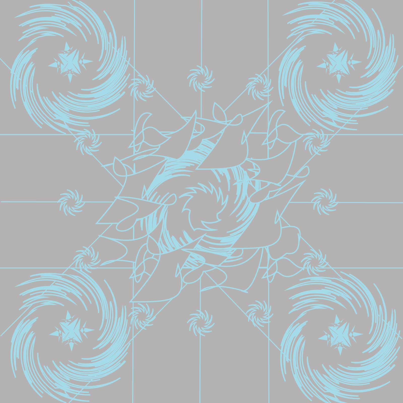
 Finally we got to make our own little thing again my weirdness kicked in and I made a duck looking thing and gave some extra stuff around I believe it had to do with something about me well I guess I can call myself a quack so I added that in. Really in that last thing I just wanted to mess with different tools and see what can be made off using only 3 shapes yes that picture is full of twisted stars, rectangle, and a circle. Well that was our first illustrator project this year and can't wait to do more.


 I was in charge of the banner, the animation, the store, and I came up with the floating pencil idea in our video. Sadly I was gone for the editing process in the video so I am unable to post my version.
  Next time we do a project like this I will probably need to make sure what events I have coming up so then I don't fall behind and try to get ahead in the project so when I get back there wont be to much to do that I wont be able to get it done. If I was to do something the same it would most likely be trying new things on the illustrator because cool things happen on accident. Accidents to me tend to always make things have a cooler affect like when I used the gradient tool and blended it with something else it made this cool kind of color that would of been great if it was in our color scheme.

 done; then we had to copy and paste and put a mask on the pictures to edit the size of them and the form.


